The old adage “less is more” still stands true – especially in the world of graphic designing, where minimalistic design has taken over. Today, almost every designer has at least one minimalist poster to showcase in their portfolio.
But what is it about this particular type of design that has made it reign supreme for so long?
The answer is simple – people want an escape from the information overload they receive on a daily basis.

Whether you scroll through your social newsfeed, skim through TV channels, or simply take a stroll down a busy street, you’ll see brands trying to push their messages everywhere.
Because of that, the average modern individual craves simplicity, and neither has the time, nor the mental energy to focus on every complex or cluttered visual they come across.
And for that very reason, minimalist designs – that convey the central message in the simplest, mildest, and cleverest way possible – have become so popular.
That’s the logical reason. Another reason is that they just look damn nice.
If you’re new to this and want to create a stunning minimalist poster like a pro, keep reading. In this article, I’ll go all-in on discussing:
- The unbreakable laws of minimalist design
- The Popular approaches to minimalistic design
- How to create a minimalist poster with Pixelied
And of course, to demonstrate my points, I’ll also be sharing some awesome examples of minimalist posters along the way.
Let’s jump in.
Table of Contents
The Absolutely Unbreakable Laws of Minimalist Design
The true essence of minimalism lies in keeping only the essentials. This core principle applies to everything, including graphic design, home decor, wall art, and even the overall way of life that some people in the Far East followed.
However, that leaves room for a lot of questions.
To provide clarity in the context of design, and ensure that you design a truly minimalist poster, I’m going to share the absolutely unbreakable laws of minimalistic design.
Apply these principles to your design, and you’ll be fine:
1. You Can’t Betray Simplicity
Simplicity is key when it comes to minimalist design.
This entails:
- Avoiding cluttering your visuals with too many elements
- Leaving very little breathing room (white space)
- Delivering too many messages through one visual
This particular poster caught my eye when I was looking for some inspiration on Pinterest, and I thought it’d be a cool example:

via hat-trick design
This poster, made by hat-trick design almost a decade ago, was for a talk delivered by Jim Sutherland at the Norwich University College of the Arts.
As you can see, there’s not much traditional design to begin with – just a curly bracket and an exclamation mark cleverly put together to form a face, with some copy that explains what the poster is about. Pretty simple, right?
Moving on, here’s another example (which is a fan-made minimal movie poster) that captures the essence of simplicity:

via Mo gohary & Mohamed Marakshy
I might be a bit biased here, because I’m a Christopher Nolan fan, but I think most would agree that the poster does an amazing job of illustrating the (rather) complex plot of the movie Interstellar in the simplest way.
The point is, no matter how complex an idea, there’s always a simple way to convey it through design. Try to figure it out.
2. Keep Only What’s Necessary
As I mentioned earlier, the key to minimalism is only sticking with the essentials.
If an element doesn’t add some sort of value to your visual, be it your clarity or aesthetics, it’s best to leave it out.
In other words, remove any unnecessary clutter from your design.
Here’s a brilliant example of this key principle in action:

Via Vinay Gowtham M
The classic fan-made movie poster includes nothing but some text and (not even an entire) character.
Of course, you don’t necessarily have to follow the exact same approach for your own minimalist poster, but let’s just say that it’s necessary to leave out the unnecessary.
Here’s another example that caught my attention:

via Greg Simpson
Only those who’ve seen Jurassic Park can understand the bone-chilling reference in this poster. Just a little context, and you get a whole new meaning to a seemingly normal illustration of a glass of water.
And not a single dinosaur in sight!
The lesson: You don’t need all the main elements to get your point across.
3. Leave as Much White Space as Possible
This one is really important and ties back to the last two principles.
A great minimalist poster needs to have a lot of white space. Period.
For complete beginners – white space is the amount of space between individual elements on any graphic/visual. And yes, in case you’re wondering, it doesn’t have to be white.
Thought I’d throw it out there.

If you stay true to the previous laws of minimalist design, you’ll automatically leave enough white space on your poster.
While all the cool designs I shared above demonstrate this principle well (especially that Monsters University poster), I felt this one did a better job of leveraging white space:

Via Leon Lee
I don’t know exactly what this poster is supposed to be for (perhaps the artist just wanted to demonstrate their skills and not target any specific brand, movie, show, message, or video game). But the black and white design checks all the boxes we’ve discussed so far:
- Simplicity
- Zero clutter
- Ample whitespace
Perhaps this will give you some inspiration for your next design.
4. Maintain That Balance
This one is a bit tricky to follow.
But it will give your minimalist poster that clean and organized look we’re all used to seeing.
To demonstrate, here’s a well-balanced design that will oddly satisfy your OCD:

via Daily Minimal
Of course, not every design has to strictly be as organized and clean as shown in the example above.
Remember – balanced doesn’t necessarily have to mean clean in a literal sense. You can also go for an abstract design (more on this later).
The key is maintaining a balance between the elements and the white space on your minimalist poster.
Popular Approaches to Creating a Minimalist Poster
There’s no one “right” way of creating minimalist posters.
However, there are certain approaches that work best (and people are used to seeing).
Below, I’ve broken down 5 popular approaches that I’ve seen a lot of graphic designers follow, along with some more awesome examples to get your creative juices flowing:
1. Incorporate Flat Illustrations
Flat illustrations are two-dimensional visuals that don’t have any glares or 3D effects.
Most minimalist posters I’ve seen incorporate flat illustrations since they are clean and don’t overwhelm the overall design.
Here is a great real-life example of a road sign made by French communication agency, TBWA\Paris, that leverages flat illustrations with pastel colors:
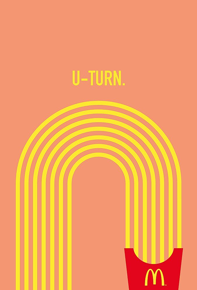
via TBWA\Paris
Granted, this isn’t a “poster,” per se, but I felt it deserved a spot in this article.
Through a clever, seemingly retro design, the sign immediately captures the attention of hungry motorists and guides them to the nearest McDonald’s.
If you like this style, you may incorporate something similar into your poster.
However, keep in mind that flat illustrations are different from line art/line drawing, in case you plan on looking for some inspiration.
2. Make Use of Typography
Another popular approach to designing awesome minimalist posters is creatively making use of typography.
This doesn’t mean using snappy, high-level copy, but focusing on the placement of text and making it the central element of your design.
Confused?
Perhaps this fan-made minimalist movie poster design will clear things up:

via Arun Raj
Now, I’m not a big fan of the movie gravity, but I absolutely love this film poster. By simply misplacing two letters, the artist hinted at the disastrous nature of the plot.
Depending on what you’re designing your poster for, you can do something similar with your poster.
The beauty of minimalist design is that you don’t have to be a professional, high-level artist to create something amazing – all you need is a bit of creativity. And posters that follow this approach demonstrate that.
3. Go All in on Abstract Design
If you don’t like any of the above-mentioned approaches, and are into fine arts, you may incorporate abstract designs in your minimalist poster.
There isn’t much advice or explanation to give here since abstract can mean a lot of things.
However, to give you an idea of what I’m talking about, here’s a decent example:

via Vlad Grama
This minimalist abstract design is for a calendar. It caught my attention because it combines different geometrical shapes in a disorganized manner, yet still manages to stay true to the principles of minimalist design.
4. Use Photography
You may also ditch illustrations and custom elements altogether, and throw photography into the mix (or combine it with those elements).
Here’s a good example:

via Alexander Solonskyi
I’m not exactly sure what this is for, but it certainly packs that punch of subtlety necessary for a minimalist design.
The key is to use high-quality photography for your poster to make it stand out.
5. Deliver a Hidden Message Through Clever Design
The main challenge of minimalistic design is that you don’t have a lot to work with as far as conveying your message goes.
To that end, artists often get a little creative to get their message across, in the most subtle way possible.
That’s what this particular approach is all about.
Here is a great example by Coca Cola:

via Coca Cola
This minimalist poster shows two hands reaching out, depicting friendship, family, and love, which are basically the core values that the Coke brand represents.
And the best part? There’s not a single mention of “Coca Cola” on the entire thing. All you see are the brand colors and an illustration that delivers the message well.
However, even if you don’t have a well-recognized brand (or want to make a non-branded message), you can still use this approach to pique the interest of your audience, get the message across, and make a lasting, memorable impact.
What’s the Best Approach to Creating a Minimalist Poster?
Believe it or not, but whatever approach you decide to take can be considered the “best,” as long as it follows the basic principles of minimalism that we discussed earlier.
Like I mentioned before, there’s not a single right way to create a minimalist poster.
Just think of a highly creative way to deliver your message, follow the playbook, and you’ll be alright.
For more inspiration, you can check out platforms like Tumblr, Pinterest, Behance, and Dribbble. Maybe you’ll find your next big idea for digital art/art posters on one of these platforms.
Whether you’re into modern art, fine art, or something more contemporary, simply search for the type of art you’re looking for and you’ll get millions of ideas.
You can also find stunning minimalist poster concepts for almost every Hollywood classic, like Fight Club, Back to the Future, and much more.
Create an Awesome Minimalist Poster with Pixelied
Here’s something that will blow your mind – if you want to create a high quality minimalist poster, you don’t necessarily need to be an expert at Photoshop or Illustrator.
With Pixelied, you can create attention-grabbing minimalist posters in a matter of a few minutes.
Below, I’ve broken down the entire process in an easy 3-step tutorial:
Step-1: Head Over to the Editor and Select a Template
To get started, simply head over to our free editor.

Here, you can either select from the hundreds of free templates at your disposal (available in different dimensions for different social and web platforms – highly recommended!) or set custom dimensions for your minimalist poster.
Step-2: Start Designing
Our user-friendly editor has all the tools you need to both customize an eye-catching template to your liking, or create something new entirely from scratch.
For starters, you can instantly access millions of royalty-free images from Unsplash right there on the Pixelied editor and incorporate them with a single click into your design.
Want to add copy? Our editor has hundreds of professional-looking fonts and text manipulation options that blow any online editor out of the water.
And that’s just the tip of the iceberg. You can also add illustrations, custom elements, icons, and even brandify your minimalist art. The options are endless.
Step-3: Download!
Once you’re finished designing your minimalist poster, simply click on the download button at the top right corner of the screen.
That’s all there is to it.
You can get your final design as a PNG, PNG transparent, JPG, SVG, WEBP, or WEBP transparent file.
![]()
Remember: Less is More!
Minimalist art can feel a bit restricting, but once you get the hang of it, you’ll definitely develop a taste for it.
Whenever you start to doubt your minimalist poster, just remember this one ultimate truth – less is more.
Happy designing!